Modern Love
A data vizualization using a dataset on American dating from Pew Research Center
Project Overview
| Summary | My Role | Tools |
|---|---|---|
| In a group of 3, we created an interactive data visualization using data from the Stanford study on how couples meet and stay together (HCMST), we were seeking to share how relationships are characterized today and how they’ve changed over time. We also aimed to show how these trends can inform the user of their potential future partners. | Exploration and analysis of dataset, Data Visualization Designer, and Data Visualization Front-end Developer | Jupyter Notebook (Python), Figma, HTML/CSS and Javascript (D3.js) |
Process
Data Discovery
Data Overview: The data is based on a survey of 3510 respondents back in 2017 done by the Stanford Sociology department and holds various information split into two major branches: people with current partners and people with past partners. Additionally, the data is nationally representative though the geographic variables have been withheld from the dataset. More information on the data itself can be found here .
Data Exploration: Looking through the data, we understood that we had a series of themes we wanted to make sure we touched upon before considering exactly what kinds of visualizations we wanted to implement. Components:
- General overview of the survey respondents (overview)
- Timeline of couples across decades (overview)
- How couples have met each other (detail)
- Detailed look at the attributes of the couples in this study (detail)
-
How couples have stayed together
Design
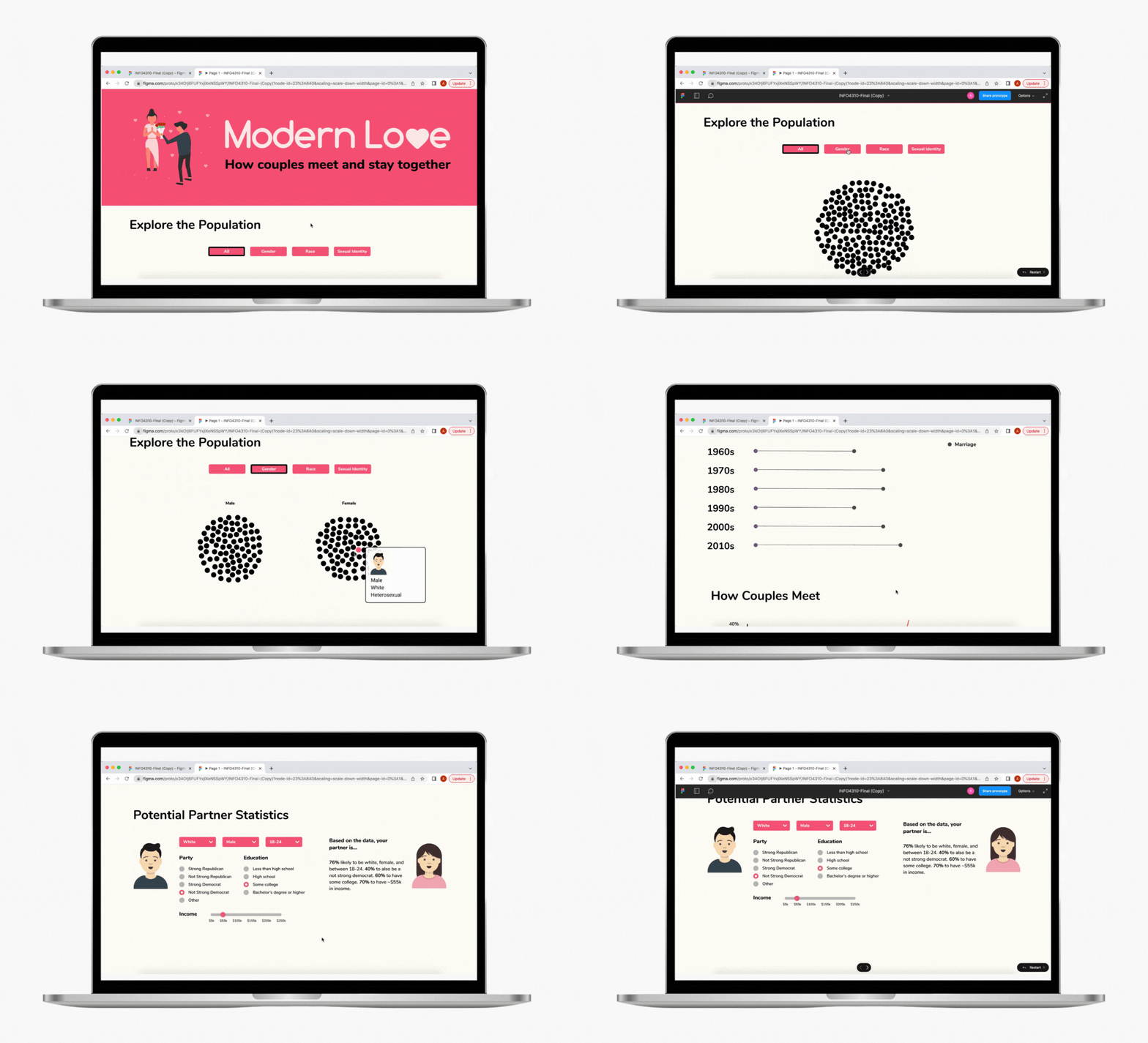
During this phase, we used Figma to design each of the components and interactions of the website

See Figma prototype here
Development
See below for the high-fidelity prototype that we created where we used the following for creation: HTML/CSS and Javascript (D3.js).